Three modes, and the palette we actually use
The app looked like a stranger next to its siblings. Twice I fixed the wrong layer before looking at the screen.
 Michael StatonMusic Editoraugmented with Claude Code on Claude Opus 5 (1M context)
Three modes, and the palette we actually use
Why Care?
corpora-builder is the fourth surface in a family of tools built by the same people for the same work. It did not look like any of them. It shipped navy and cyan; its siblings render violet and electric magenta on near-black.
That is worth a ship note on its own. What makes it worth reading is that the fix took three attempts, and the first two were confident, well-argued, and aimed at the wrong layer.
What's New?
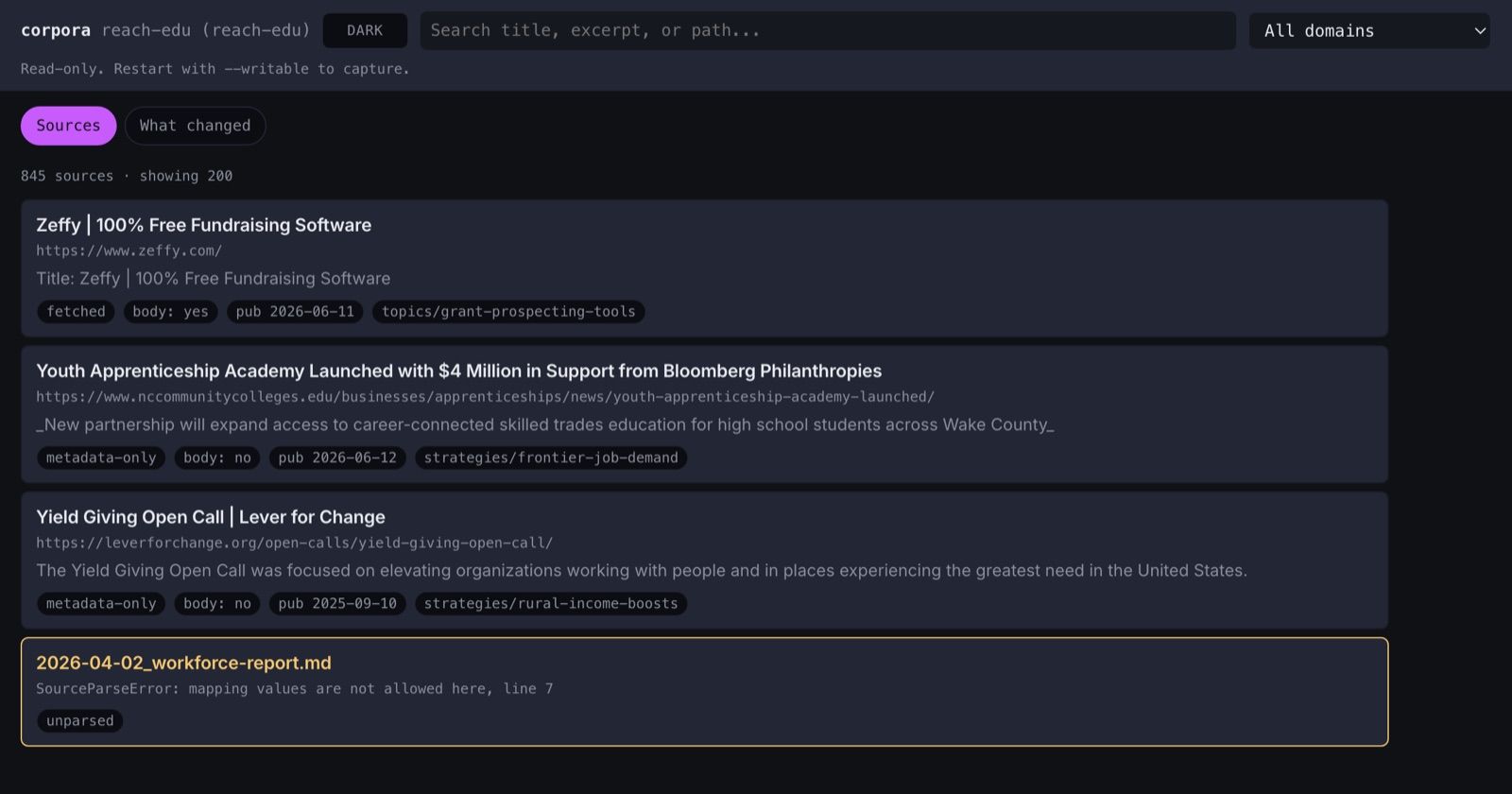
Three modes — light, dark, vibrant — switched from a cycle button in the header. Dark is the default.
The family palette. Electric magenta on near-black, from
augment-it/packages/theme/theme.css.The house token architecture: named palette → theme bindings → consumers, with
data-themeanddata-modeas independent axes.A monospace instrument panel wrapped around one reading surface — chrome in JetBrains Mono, source titles and excerpts in Inter.
design-drift.mjs— five checks, wired intoscripts/check.shas a blocking rung.
Added in the 2026-08-23 revision:
A workspace switcher and a one-icon mode toggle in the header, ported from augment-it and the splash pages respectively.
An app mark — a leaning stack of paper — standing where the wordmark was, with a different treatment per mode rather than a tint.
A theme-aware favicon, which is the last surface where a mode can still be answered at runtime.
The three attempts
One: renaming tokens, which changed nothing
The first pass renamed this app's tokens to match augment-it's spelling.
--ink → --color-text, --line → --color-border, 39 call sites, no colour
changes. The argument was sound: patterns travel this tree by copy-from rather
than by shared package, so the vocabulary is the interface, and a component
cannot be copied across a rename.
It was also invisible. A rename changes no pixels — that is what makes it safe — and reporting it as convergence was simply wrong. The screenshot that came back looked identical to the one before, because it was.
Two: keeping a palette nothing renders
The second pass added borders and density but kept navy/cyan/amber, on the
reasoning that it was the family brand inherited from
memopop-ai/packages/shared-styles.
No shipping app consumes that package. That fact was already written in this
repo's own token file — memopop-native does not import shared-styles despite
its CLAUDE.md saying it does; it draws violet out of roughly 700 hardcoded
literals and two locally-reinvented token sets. augment-it draws electric
magenta. Both live surfaces are one violet-magenta family. shared-styles is a
fourth palette that nothing paints.
The file documented the drift and then treated the drifted-from package as authoritative anyway. Twice.
Three: reading the convention instead of an app
The real error was underneath both. The reference being followed was augment-it's
DESIGN.md — which is an elaboration of the house system, with federation
vocabulary layered on top. The convention itself lives in
astro-knots/context-v/blueprints/Maintain-Themes-Mode-Across-CSS-Tailwind.md
and the theme-system skill, and it says three things the elaboration obscures:
| The convention | What had been built | |
| Layers | three: named palette → theme bindings → consumers | four tiers, with --fx-* as its own |
| Axes | data-theme × data-mode, independent | one data-mode, collapsed |
| Modes | three, and vibrant is dark-based | two |
Collapsing the two axes costs nothing until a second brand exists, and then it
costs everything — which is exactly why the theme here is called labs and not
didi. Converging the didi.sh brand onto this palette is separate, deliberate
work, and the axis exists so it does not happen by accident during a restyle.
Three modes, and vibrant is not light
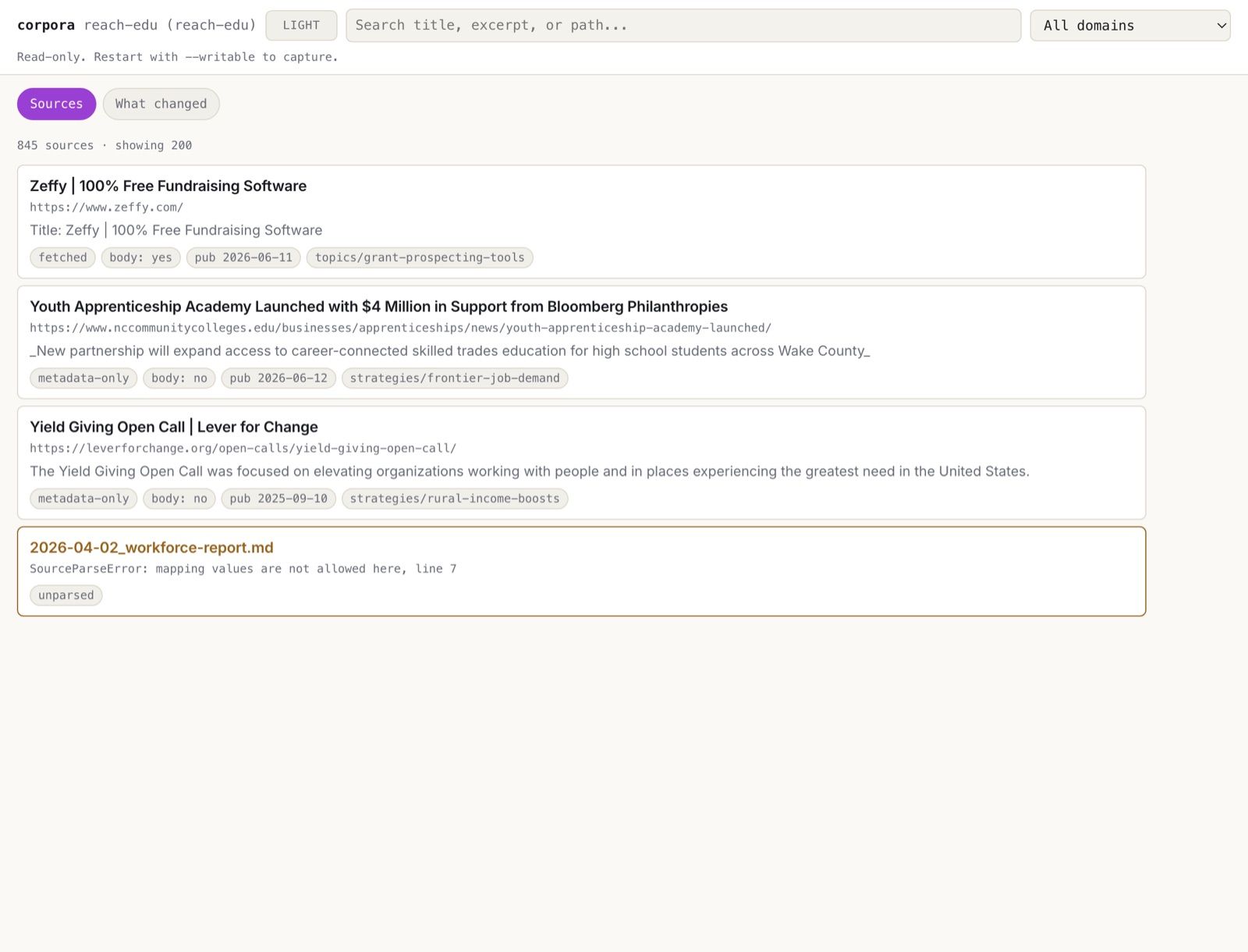
Light is warm paper and deep violet — not white and grey. The blueprint's argument for three modes is stakeholder management: nerds pick dark, traditionalists pick light, design-forward stakeholders pick vibrant, and the toggle ends the argument before it starts.
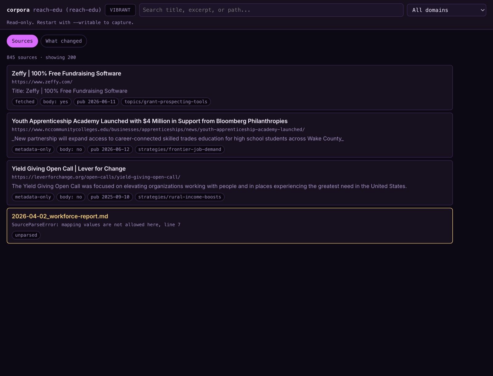
Vibrant is dark-based. The blueprint names the inverse — vibrant inheriting
light's white background — as the classic error, so vibrant gets its own
violet-tinted near-black void ramp rather than borrowing dark's greys.
The header cycles rather than toggles. A two-state toggle cannot reach a third mode, and three modes with no way to reach two of them is dead code.
Under the hood
The one deliberate divergence
augment-it is monospace throughout; it operates records. This app is read — 845
source titles and excerpts scanned for meaning — and mono costs scanning speed
across a list that long. So chrome is --font-body (JetBrains Mono, like the
family) and the reading surface alone is --font-reading (Inter).
That is the only exception, it is named in DESIGN.md, and the role names are
descriptive rather than --font-sans / --font-mono per the blueprint's §2.4 —
"heading-1" means nothing to anyone outside the code.
Rendering found what reading could not
Three careful readings of the CSS missed this. Headless Chrome, against a fixture
page carrying the real tokens.css and the real markup, found it in one shot:
--color-surface: var(--color__graphite-700);   /* #232634 */
--color-border:  var(--color__graphite-800);   /* #232634 */
Identical. Every card drawn as border: 1px solid var(--color-border) over
var(--color-surface) painted nothing in dark mode. It is augment-it's open
gate A22 — its own contrast pass measures --color-border at 1.2–1.5:1
against a 3:1 requirement for control boundaries — and it travelled here with the
palette. --fx-card-border now points at graphite-850, a darker hairline that
reads as a seam and leaves the border free for hover to move. Light and vibrant
need no override.
The harness costs about a minute and needs no backend. It is now the habit.
Five checks, and two bugs in the checks
app/scripts/design-drift.mjs, zero dependencies, blocking in check.sh:
| D1 | no component reads a Tier-1 name |
| D2 | no colour literal below Tier 1 |
| D3 | a higher step number is never lighter |
| D4 | DESIGN.md agrees with tokens.css on every colour Tier 2 uses |
| D5 | no component reads a token that does not exist |
Each was verified by injecting its violation and confirming it fires. That found two bugs in the checks themselves:
D2 anchored on the string
"Tier 2"and matched it inside the file's own header comment, so on its first run it flagged all 35 primitives.D4 only walked numeric ramp steps, which meant it had never checked the accents — the colours a reader of
DESIGN.mdmost needs to be right. It now covers all 40 named colours Tier 2 points at.
D3 found two real inversions in the upstream palette: paper-200 is lighter
than paper-100, and void-700 is darker than void-900. Both are augment-it's
A19 class — a step number that lies is worse than no name, because an agent will
reason from it. They are listed in KNOWN_UPSTREAM with the reason rather than
suppressed, so the Tier-1 names stay byte-identical across the two repos.
D5 is the one worth copying. A var() naming nothing paints nothing,
silently, and the CSS is syntactically perfect — augment-it counted 33 of them.
Added 2026-08-23 — the header, and a mark
Two surfaces the three-mode contract had not reached yet. Neither is its own ship: they are the same architecture applied twice more, and the interesting part is where a token swap turned out not to be enough.
The workspace stopped being a label
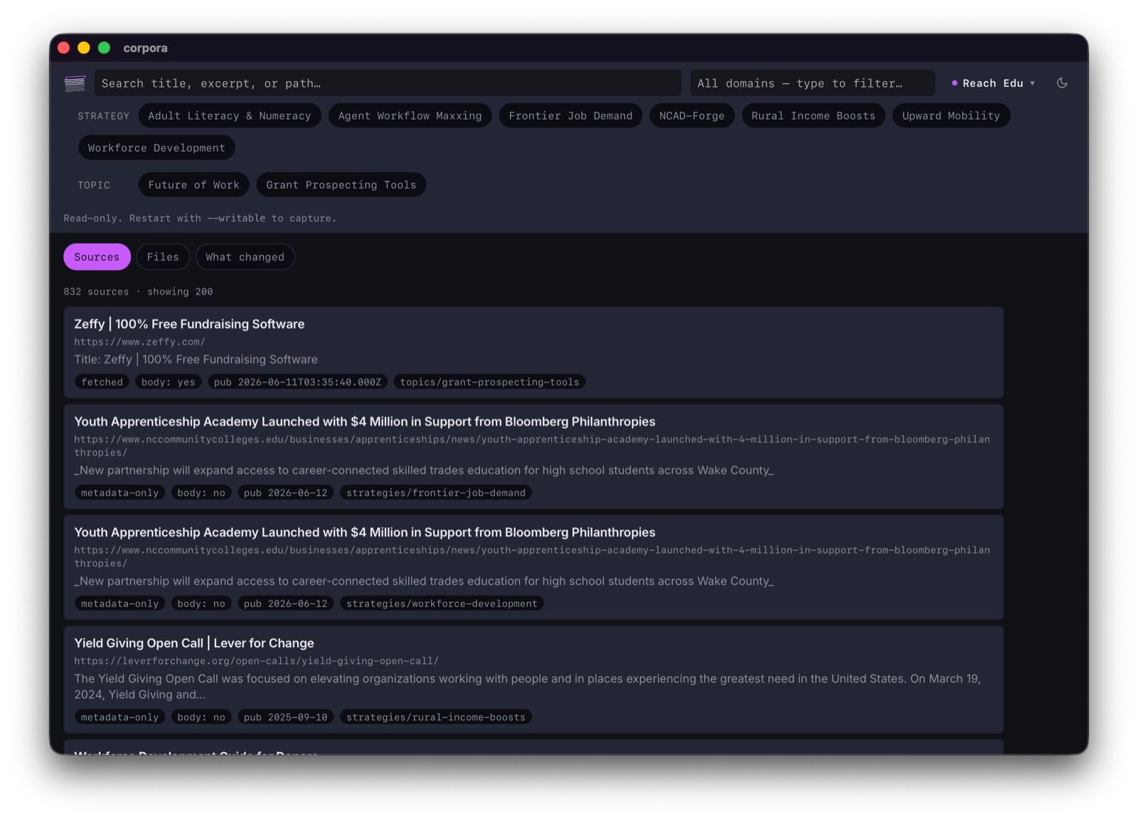
The header read corpora reach-edu (reach-edu) — a slug printed twice, with a
bucket name leaking into the product, and no way to see or change which corpus
you were in.
It is now the switcher from augment-it/shell/src/WorkspaceSwitcher.svelte, port
rather than dependency: same trigger, same listbox, same interaction contract,
same top-right position so someone who uses both apps does not have to look in
two places. The trigger carries the display name only; the slug appears
solely inside the dropdown, where an operator goes when they need to know exactly
what they are pointed at.
Two smaller corrections fell out of it. display_name had been defaulting to the
slug — that is where (reach-edu) came from — and is now humanised, with
CORPORA_WORKSPACE_NAME still winning because no rule turns ncad-forge into
NCAD-Forge. And /api/meta stopped shipping a pre-rendered label: a server
that formats a string has made a layout decision on the client's behalf.
One mode icon that says what comes next
The three glyphs are the canonical ones from
ai-labs/splash/src/components/ModeToggle.astro. The splash pages show all
three and glow the active one; here it is a straight swap. A three-button group
is right on a marketing page where the modes are part of the pitch — in a dense
tool it is three targets to do one thing.
Which makes the tooltip load-bearing, because an icon that changes on click without saying what it becomes is a guessing game:
Dark mode · click for VibrantGenerated from the cycle rather than written out, and the test asserts that structurally, so it survives someone reordering the modes.
The mark
A leaning stack of paper, chosen from ten drafts. The lean is the point — the
brief was "a pile of paper that's a bit not straightly aligned", and an upright
stack is a ream rather than a pile somebody has been working through. It stands
where the wordmark was, with corpora kept as the accessible label.
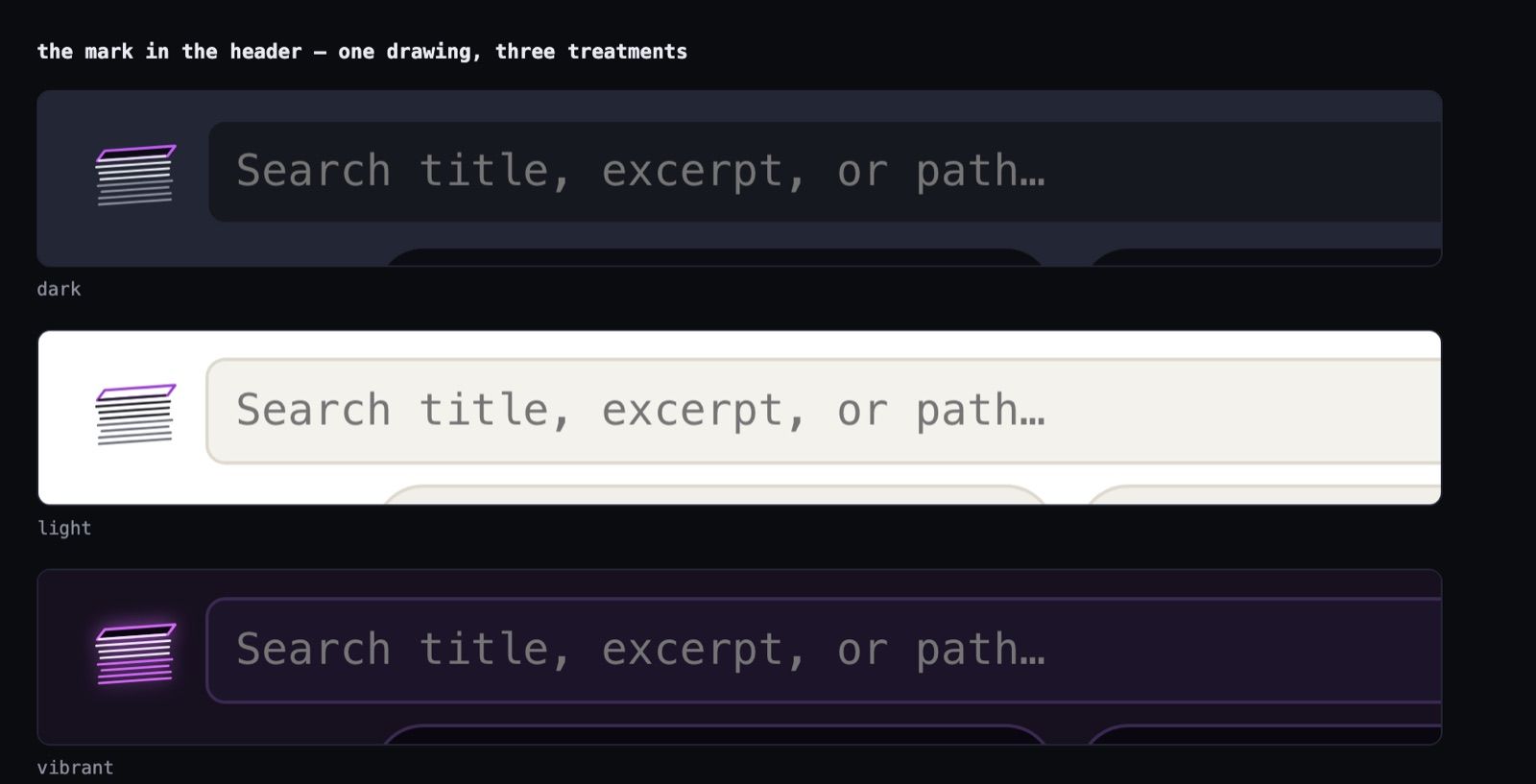
Three treatments, not three tints — and this is where the theme system earned its keep and also found its edge:
| sheets | top sheet | glow | |
| dark | cool paper | electric magenta | none |
| light | full ink | deep magenta | none |
| vibrant | halo → loud magenta | loud magenta | a real drop-shadow |
Light is a genuine re-cut, not a re-point. Outline art inverts badly: white-on-dark becomes grey-on-white and loses most of its contrast. Everywhere else in this app a mode is one indirection; here the drawing itself had to change, which is worth knowing before someone assumes tokens make artwork mode-agnostic.
Two line counts, one silhouette. Fifteen edges is right at icon size and mud in a header — at 26px they land about 1.3px apart and merge into a grey block. The small cut subsamples the same jittered curve, so outline, lean and top face are identical and only density changes.
And the icon drafts had a bug that every contact sheet hid: the chosen one overflowed its own viewBox, so the bottom of the stack was being clipped in every render shown. Caught by doing the arithmetic while lifting it into a component, not by looking at it.
What the packaged icon cannot do
The favicon is now static/favicon.svg, carrying both palettes and switching
on prefers-color-scheme — which an SVG favicon can do and a .ico cannot. It
also closes a 404 that had been sitting in the console.
The dock icon gets no such luxury. A .icns is bitmaps with no theme awareness,
so it takes one baked palette; three variants are cut and dark is the one to ship.
Worth stating plainly, because "the theme handles it" stops being true at exactly
the boundary where the OS starts drawing instead of the browser.
What's Next
A brand-kit page. The blueprint expects one; there is nowhere in-app to see the palette.
Contrast measurement. augment-it verifies all 108 text-on-surface pairs; this repo inherits the numbers without re-measuring them against its own surface pairings, and A22 is proof that inheriting is not the same as checking.
The didi.sh theme. The axis is free and the work is not started.
Cut the real dock icon from
mark-dark.svg. The drafts exist; the.icnsdoes not.
Related
app/DESIGN.md— the local contract, and the worked example of the layeringastro-knots/context-v/blueprints/Maintain-Themes-Mode-Across-CSS-Tailwind.md— the conventionai-labs/context-v/reminders/Load-The-Theme-System-Before-Touching-Tokens.md— so this costs one session and not twocontext-v/specs/Header-Chrome.md— the header work added in the revisionapp/src-tauri/icons/drafts/— the ten drafts the mark was chosen fromchangelog/2026-08-22_04.md— the surface this restyles